
- Calm bedroom colors such as soft blues, muted greens, and warm neutrals help reduce stress and promote relaxation.
- The best bedroom paint colors create a soothing backdrop without overwhelming the space or competing with décor.
- Blue and green tones are strongly associated with nature and are proven to support better sleep and emotional balance.
- Warm neutrals offer comfort and versatility, especially when layered with textures to avoid a flat or sterile look.
- Lighting and room size significantly affect how paint colors appear and should always be considered before choosing a shade.
- Testing paint samples in different lighting conditions helps ensure the color maintains a calm, relaxing feel throughout the day.
Creating a calm and relaxing bedroom starts with color. For homeowners, the bedroom is more than just a place to sleep—it’s a personal retreat where stress should melt away at the end of the day. The right paint color can influence mood, improve sleep quality, and make a space feel balanced and welcoming. On the other hand, poor color choices can make a bedroom feel overstimulating, cold, or visually cluttered.
This guide explores the best bedroom paint colors for relaxation, explains why they work, and shows how to use them effectively. Whether you’re repainting a master bedroom or refreshing a guest room, understanding how color psychology and design principles work together will help you make confident, calming choices.
Why Bedroom Color Matters for Relaxation

Color has a direct impact on how the brain processes space, light, and emotion. In a bedroom, where rest and recovery are priorities, overly bright or intense colors can subconsciously trigger alertness instead of calm. Homeowners often underestimate how much wall color affects sleep patterns, stress levels, and even room temperature perception.
Soft, muted hues tend to slow visual stimulation, allowing the mind to unwind more easily. They also reflect light gently, which reduces harsh contrasts that can feel energizing rather than soothing. When paired with appropriate lighting and furnishings, the right bedroom color can create a sense of stability and comfort. Choosing calming tones is not about following trends, but about selecting colors that support rest, balance, and emotional well-being over the long term.
What Are the Best Colors to Paint a Bedroom for a Calm and Relaxing Atmosphere?
When homeowners ask this question, the answer lies in colors that feel soft, natural, and emotionally grounding. Calm bedroom colors usually sit in the lighter or muted range of the color spectrum, avoiding sharp saturation or extreme contrast. These shades create a peaceful backdrop that doesn’t compete for attention, allowing the room to feel cohesive and serene.
The best colors for a relaxing bedroom also adapt well to different lighting conditions, from morning sunlight to warm evening lamps. This versatility ensures the space feels comfortable throughout the day. Rather than overpowering the room, these colors work quietly in the background, supporting rest and relaxation while complementing furniture, textiles, and décor choices.
Top calming bedroom color choices
- Soft blues – Promote tranquility and are often linked to improved sleep quality
- Muted greens – Evoke nature and balance without feeling cold
- Warm neutrals – Create comfort while maintaining a clean, timeless look
- Lavender and pale purple – Add subtle warmth and calm without heaviness
How Soft Blues and Greens Create a Peaceful Bedroom
Blue and green tones are among the most recommended colors for a calming bedroom because they are closely associated with nature. Blue reflects the sky and water, which the brain often interprets as stable and restful. Green, inspired by plants and landscapes, creates a sense of renewal and emotional balance that homeowners find especially comforting.
These colors work best when softened with gray or neutral undertones, preventing them from feeling too bright or childlike. Pale blue can make a bedroom feel airy and cool, while sage or eucalyptus green adds warmth without visual noise. When used thoughtfully, these shades help reduce mental fatigue and encourage relaxation, making them ideal for primary bedrooms and guest rooms alike.
Tips for using blues and greens effectively
- Choose matte or eggshell finishes to reduce glare
- Pair with natural materials like wood or linen
- Avoid overly saturated or neon variations
Using Neutrals Without Making the Bedroom Feel Boring
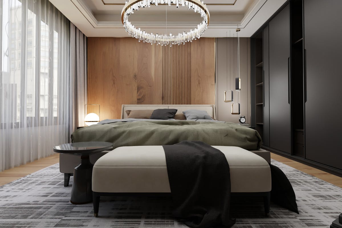
Neutral colors are a popular choice for homeowners seeking a calm bedroom, but not all neutrals create the same effect. Stark whites and cool grays can sometimes feel sterile or impersonal if not balanced properly. Warmer neutrals, such as beige, greige, and soft taupe, provide a soothing foundation while still adding depth and character.
These tones work especially well in bedrooms with limited natural light, as they prevent the space from feeling cold or flat. Layering neutrals with texture—through bedding, rugs, or curtains—keeps the room visually interesting without sacrificing calm. Understanding how to pick paint colors within the neutral family allows homeowners to create a relaxing space that feels intentional rather than plain.
Calming neutral shades to consider
- Warm off-white
- Light taupe
- Soft beige with pink or yellow undertones
How Lighting and Room Size Affect Bedroom Paint Choices
Lighting and room size play a major role in how paint colors are perceived in a bedroom. A color that looks calming in a large, sunlit space may feel dark or heavy in a smaller room with limited windows. Homeowners should consider how natural and artificial light interact with wall color throughout the day.
Lighter shades tend to reflect more light, making small bedrooms feel open and breathable. In larger rooms, slightly deeper muted tones can add coziness without overwhelming the space. Testing paint samples on different walls and observing them at various times of day helps ensure the color maintains its calming effect in all lighting conditions.
Final Thoughts: Creating a Bedroom That Truly Feels Restful
Choosing the best bedroom paint color is about more than aesthetics—it’s about supporting rest, comfort, and emotional balance. Calm colors like soft blues, gentle greens, and warm neutrals help transform bedrooms into spaces where homeowners can genuinely relax. When paired with thoughtful lighting and simple décor, these colors create a timeless and peaceful environment.
By focusing on mood, light, and personal comfort rather than trends alone, homeowners can create a bedroom that feels restorative every day.