
- Professional interior designers choose paint colors based on purpose, lighting, and context—not just personal preference or trends.
- Lighting dramatically affects how paint colors appear, so testing samples at different times of day is essential before committing.
- Understanding undertones helps prevent color clashes with flooring, furniture, and fixed finishes.
- Matching paint colors to the function of each room creates spaces that feel comfortable, balanced, and intuitive to live in.
- A cohesive whole-house color palette makes rooms flow naturally and gives the home a polished, intentional look.
- Proper paint testing and selecting the right finish are just as important as choosing the color itself.
Choosing paint colors can feel deceptively simple—until you’re standing in front of hundreds of swatches, second-guessing every choice. Professional interior designers approach color selection with a blend of technical knowledge, visual psychology, and practical experience. They don’t rely on instinct alone; instead, they follow a structured process that balances aesthetics, function, lighting, and long-term livability. For homeowners, learning this process can save time, money, and the frustration of repainting rooms that don’t feel quite right.
This guide breaks down exactly how professionals pick paint colors and how you can apply the same methods in your own home. From understanding light and undertones to testing samples correctly and building a cohesive palette, each section mirrors real-world design practices.
Whether you’re repainting a single room or planning a whole-house refresh, this article will help you make confident, informed decisions that elevate your space.
Understanding How Interior Designers Think About Color
Professional interior designers don’t start with paint chips. They start with purpose, context, and how a space is meant to function. Color is treated as a supporting element, not the star of the show. Designers analyze how people will move through a room, how long they will spend there, and what mood the space should evoke. A bedroom, for example, requires a very different color strategy than a home office or kitchen.
Designers also think long-term. Trends come and go, but repainting is expensive and disruptive. That’s why professionals favor colors that age well and adapt to changing décor. They consider fixed elements like flooring, cabinetry, and countertops before committing to a shade. This mindset ensures the paint color works with the home, not against it, and prevents costly mistakes that homeowners often make when choosing colors in isolation.
Color as a Supporting Design Element
Paint color enhances furniture, textures, and architectural features rather than competing with them. Designers aim for harmony instead of dominance.
Function Dictates Color Choices
Rooms designed for rest, focus, or socializing each require different color temperatures and saturation levels.
Longevity Over Trends
Professionals balance current styles with timeless appeal to avoid frequent repainting.
How Lighting Affects Paint Colors More Than You Think
Lighting is one of the most underestimated factors in paint selection, yet it is one of the first things designers evaluate. Natural and artificial light dramatically change how a color appears on your walls. A soft neutral can look warm and inviting in one room but dull or cold in another, depending entirely on light exposure. This is why paint often looks different at home than it did in the store.
Designers study the direction a room faces, the size and placement of windows, and the type of lighting fixtures used. North-facing rooms tend to have cooler, muted light, while south-facing rooms receive warm, consistent daylight. Artificial lighting also matters, as LED, incandescent, and fluorescent bulbs each cast different tones. Understanding this interaction allows homeowners to choose colors that stay consistent and flattering throughout the day.
Natural Light Direction
- North-facing rooms emphasize cool undertones
- South-facing rooms enhance warmth and brightness
- East-facing rooms change dramatically from morning to afternoon
- West-facing rooms intensify warm tones in the evening
Artificial Lighting Types
Warm bulbs enhance reds and yellows, while cool bulbs emphasize blues and grays. Always consider your lighting setup before finalizing a color.
How to Pick Paint Colors Based on Room Purpose
Professional designers never choose paint colors without considering how the room will be used. Color influences mood, energy levels, and even productivity. Homeowners often focus on what looks nice instead of what feels right, but designers prioritize experience over appearance. A well-chosen color supports how you live in the space every day.
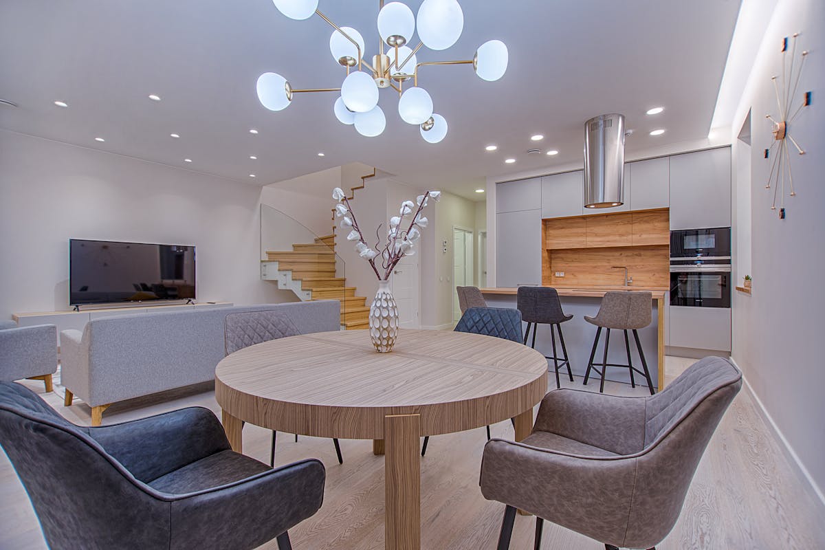
Living areas benefit from welcoming, balanced tones that encourage conversation and comfort. Bedrooms require softer, calming shades that promote rest. Kitchens and bathrooms often work best with clean, light-reflective colors that feel fresh and hygienic. By aligning color choices with function, designers create spaces that feel intuitive and comfortable rather than visually overwhelming.
Living Rooms and Common Areas
- Warm neutrals for comfort and versatility
- Muted colors that work with multiple décor styles
Bedrooms and Private Spaces
- Soft blues, greens, and warm grays
- Low-saturation colors for relaxation
Kitchens and Bathrooms
- Light neutrals and subtle contrast
- Colors that enhance cleanliness and brightness
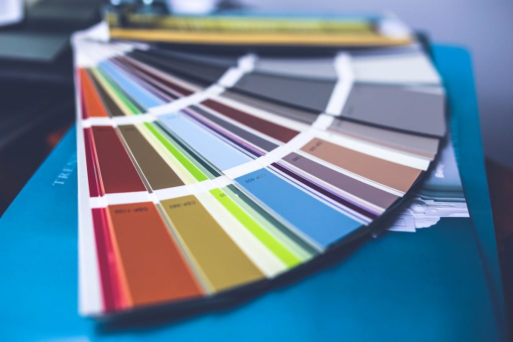
Using Undertones the Way Designers Do
Undertones are subtle hues beneath the surface color, and they are a major reason paint colors fail or succeed. Two shades may look similar on a paint card but appear completely different once applied. Designers are trained to identify undertones and predict how they will interact with surrounding elements like floors, furniture, and lighting.
Common undertones include warm (yellow, red, beige), cool (blue, green, violet), and neutral-balanced blends. A gray with a blue undertone can look crisp and modern or icy and uninviting, depending on the room. Designers always compare paint samples against fixed finishes to ensure undertones complement rather than clash. This attention to detail is what separates professional results from amateur ones.
Identifying Undertones
Compare the paint sample next to pure white to reveal hidden hues.
Matching Undertones to Fixed Elements
Coordinate with flooring, cabinetry, stone, and fabrics that won’t change.
Avoiding Undertone Clashes
Never choose paint in isolation; always test alongside existing finishes.
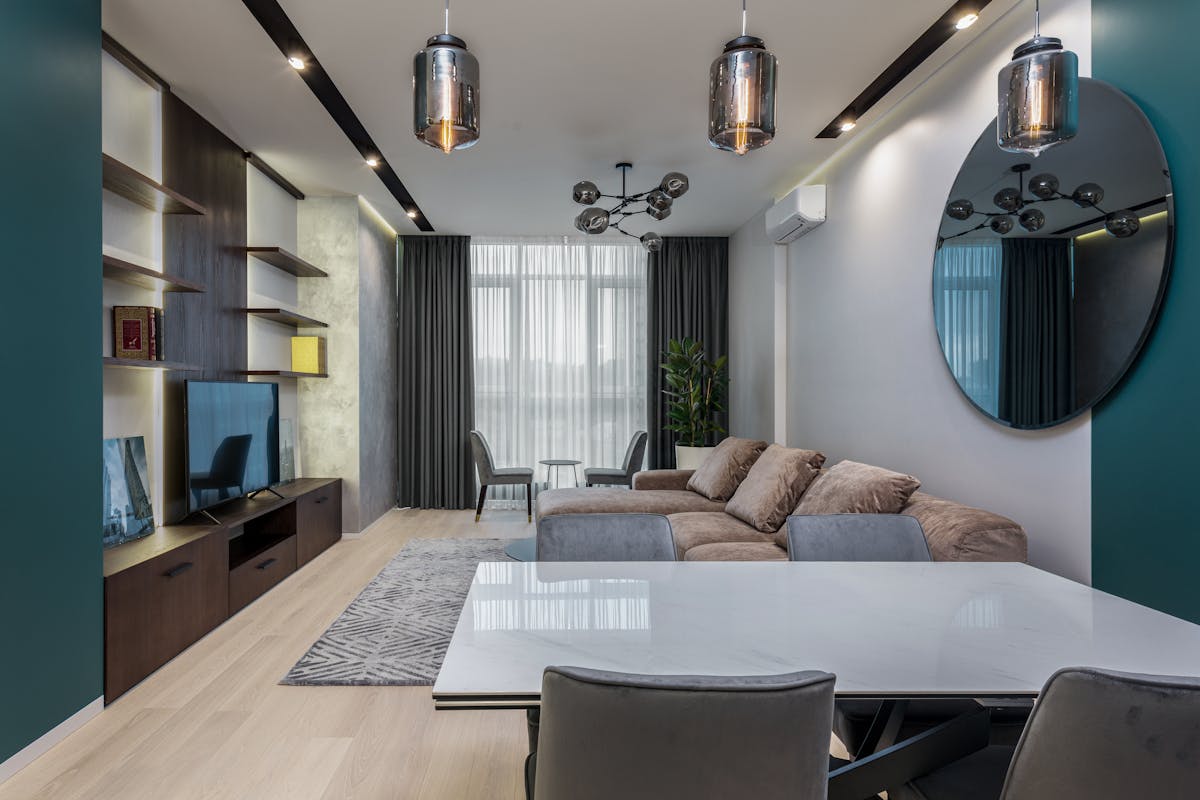
How Designers Build a Cohesive Color Palette for the Whole House
A common homeowner mistake is choosing colors room by room without considering how they flow together. Designers think of a home as a single, connected environment. Even when rooms have distinct personalities, the overall palette should feel cohesive and intentional. This approach creates visual harmony and makes a home feel more polished.
Professionals typically start with a neutral base color that appears in multiple areas. From there, they introduce complementary or analogous colors for variation. Accent colors are used sparingly and repeated strategically to tie spaces together. This method allows each room to feel unique while still belonging to the same home.
Starting With a Base Color
Choose a versatile neutral that works in most spaces.
Layering Secondary and Accent Colors
Use related shades to add depth without chaos.
Repeating Colors Strategically
Echo colors through textiles, artwork, and décor for continuity.
The Professional Way to Test Paint Samples at Home
Testing paint is not as simple as brushing a swatch on the wall. Designers follow a precise testing process to see how color behaves in real conditions. They understand that paint can look dramatically different once dry and under changing light. Skipping this step is one of the most common causes of repainting regret.
Professionals apply large sample patches or use sample boards that can be moved around the room. They observe the color at different times of day and against various backgrounds. This method reveals how the paint interacts with light, shadows, and furnishings, giving homeowners a realistic preview before committing.
Proper Sample Size
Test patches should be at least 12 by 12 inches.
Observe Over Time
Check the color in morning, afternoon, and evening light.
Test Multiple Walls
Different walls reflect light differently, even in the same room.
Why Finish and Sheen Matter as Much as Color
Paint color is only half the equation; finish plays a major role in the final look. Designers choose sheen based on durability, light reflection, and surface imperfections. A beautiful color can look completely wrong if paired with the wrong finish. This is especially important for homeowners with textured walls or high-traffic areas.
Flat and matte finishes hide imperfections but are less durable. Satin and eggshell finishes strike a balance between softness and cleanability. Semi-gloss and gloss finishes reflect light and highlight architectural details but can exaggerate flaws. Designers match finish to function to ensure both beauty and practicality.
For homeowners planning a home renovation on a budget, selecting the right paint finish can significantly reduce long-term maintenance costs. Durable finishes in high-traffic areas minimize the need for frequent touch-ups, making paint one of the most practical budget home renovation ideas when applied with professional-level planning.
Common Sheen Uses
- Flat or matte for ceilings and low-traffic walls
- Eggshell or satin for living spaces
- Semi-gloss for trim, kitchens, and bathrooms
Light Reflection Considerations
Higher sheen equals more light reflection and visibility of texture.
Common Paint Color Mistakes Designers Avoid
Interior designers have seen countless paint disasters, which is why they follow proven rules. Homeowners often rush decisions, rely too heavily on trends, or choose colors based on emotion alone. Designers avoid these pitfalls by sticking to process and testing thoroughly.
Another common mistake is ignoring scale. Dark colors can overwhelm small rooms if not balanced properly, while overly light colors can feel flat in large spaces. Designers also avoid matching paint too closely to furniture, preferring complementary contrast instead. Learning these lessons can prevent costly do-overs.
Mistakes to Watch Out For
- Choosing colors in-store only
- Ignoring undertones and lighting
- Following trends without context
How Professionals Prevent Errors
They slow down, test extensively, and consider the whole home.
When to Use Bold Colors Like a Designer
Bold colors are not off-limits, but designers use them strategically. Instead of painting every wall, they often apply bold shades to accent walls, built-ins, or smaller spaces like powder rooms. This creates impact without overwhelming the home.
Professionals also balance bold colors with neutrals to maintain visual comfort. A deep navy or emerald green can feel luxurious when paired with soft whites or warm woods. The key is intention—bold colors should enhance a space, not dominate it.
Smart Ways to Use Bold Paint
- Accent walls or architectural features
- Small rooms for dramatic effect
Balancing With Neutrals
Anchor bold colors with calm, neutral surroundings.
Final Thoughts: Think Like a Designer, Paint With Confidence
Picking paint colors like a professional interior designer is less about talent and more about process. By understanding lighting, undertones, room function, and flow, homeowners can make choices that feel intentional and timeless. Designers rely on testing, patience, and context—not guesswork or impulse.
When you slow down and follow these principles, paint becomes a powerful design tool rather than a source of stress. Whether you’re refreshing a single room or updating your entire home, using a designer’s approach will help you create spaces that look polished, feel comfortable, and stand the test of time.